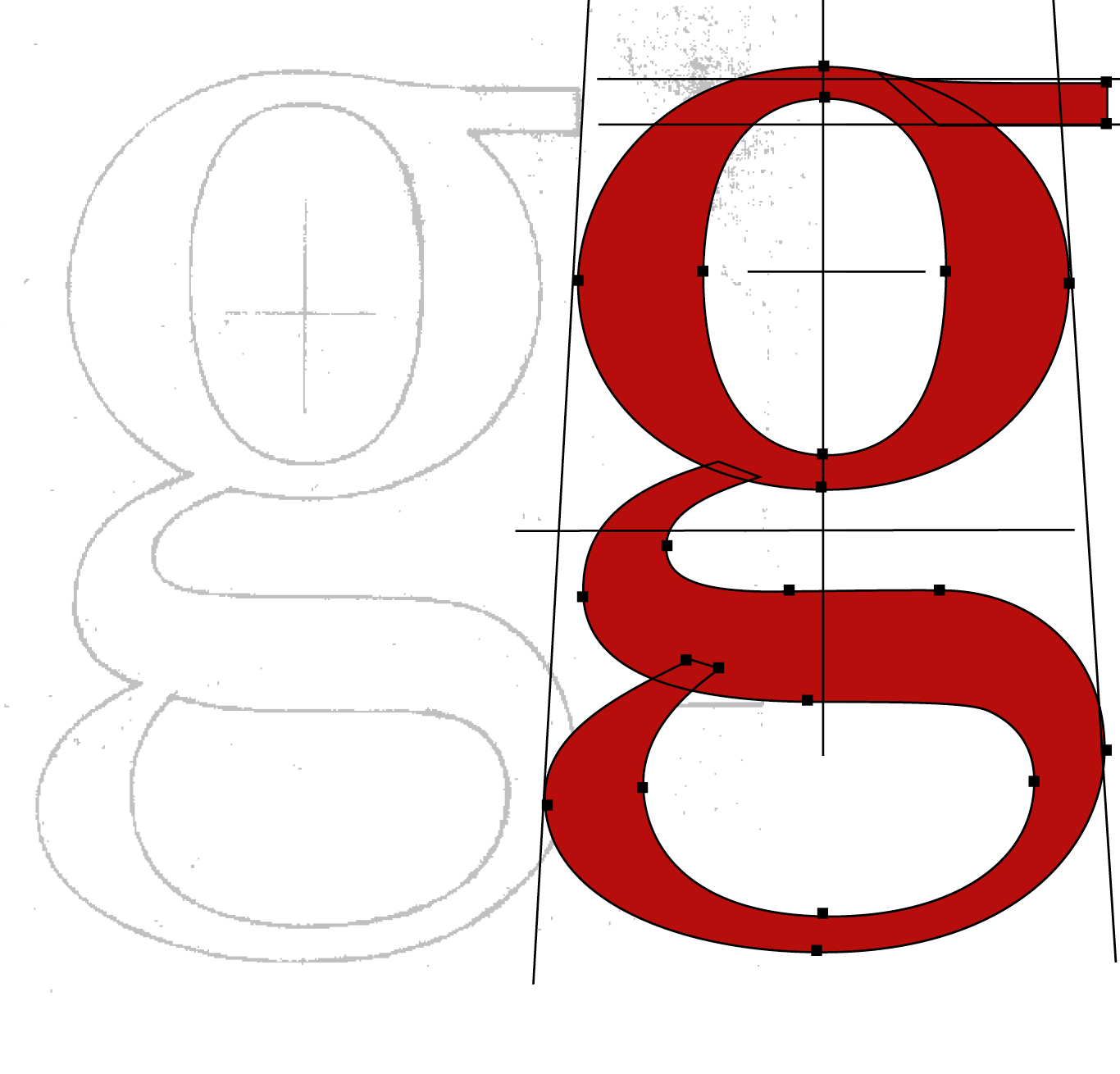
Housestyle Graphics specialise in the creation of fonts, mastheads and logotypes using the combined skills of Richard Dawson and Dave Farey, who have drawn and designed type digitally for more than 20 years. Before the digital era they created typefaces and letterforms conventionally, as artwork and using photo mechanical processes.
Art directors and designers invariably know what they want, but need collaboration with Housestyle for added creativity and visual refinement, to convert their concept into typographic reality.
> Richard Dawson
richard@housestylegraphics.com
> Dave Farey
dave@housestylegraphics.com

With a long history developing retail fonts for ITC, Letraset and Monotype as Panache Typography, most of the fonts we now create are commissions for publishing, corporate, promotional and educational use.

If you read newspapers and magazines or go online and watch TV and travel along the high street, then you will have seen the unique letter forms drawn and digitised by Housestyle.

Mastheads, like logos, are brands so they should be distinctive and memorable. We have created national and local newspaper mastheads in the UK and for papers in Europe, Asia and Australia – and the same for magazines and journals.

Alphabets are the bedrock of graphic communication. We use our skills and experience on a wide range of identity projects where nuance and subtlety are regularly needed for developing exclusive letterforms and fonts.

We collaborate with Arlette and Mourad Boutros (Boutrosfonts.com) designing Roman alphabets to compliment their Arabic fonts. The five weight family of Arlette Sans is used extensively for online bookings, flights, hotels and traveller experience.

The Burlington magazine was founded in 1903. Michael Booth, creative director of Studio Frank (wearefrank.co.uk) guided the publication into the digital environment, with this new masthead inspired by the original Arts & Crafts design.

Kidscape is an anti-bullying charity rebranded by Simon Case of Chromatic Brands (chromaticbrands.com) who designed an intricate K logo accompanied with simple hybrid letterforms, developed from Edward Johnston’s iconic alphabet.
