‘Take a gnat’s bollock off that’
from Circular, The magazine of the Typographic Circle, Issue 6 Summer 1996
from Circular, The magazine of the Typographic Circle, Issue 6 Summer 1996
On a mild autumn evening in 1995, the good, the bad and the ugly from the type world gathered together in the largest pub in Waterloo to celebrate Colin Brignall’s final release, for good conduct, from Esselte Letraset. This was Colin’s third breakout, with two brief youthful forages into the photosetting world taken into account, before completing 30 years as Letraset’s Main Man. All the guests for this memorable occasion were there by invitation, some from distant lands on their way to ATypl in Barcelona, and with all designer generations represented, a type groupie would have had a field day with an autograph book or camcorder.
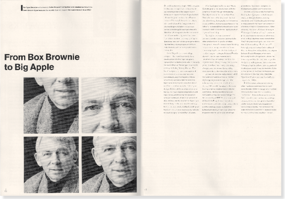
Colin Brignall is a renowned type designer — but more importantly, for a great number of other type designers, typographers and designers — he is probably the most effective British type director this century, including Stanley Morison. The list of designers he has encouraged and commissioned to create alphabets is considerable, and the majority of those who initially worked under his direction have gone on to become established and confident contributors in the field of type design. Colin’s ability as a type director is having the knack of predicting fashion and type trends, and knowing the designers who can do the job. There is an amount of discussion currently on whether digital type is stretching the boundaries of font design, but the Letraset studio, led by Colin Brignall, has been instrumental in producing radically relevant designs for more than 20 years. After leaving school in the late 1950s, Colin Brignall’s first involvement with the graphic arts was through photography. Based just around the corner from Fleet Street, he worked for six years in fashion and advertising photography for the national press, and then, from an acquaintance of his father’s, he learned that Letraset were taking on studio staff to handle the rapid growth of dry transfer lettering.
Typestyles, the very essence of Letraset’s product success, can mainly be attributed to Colin Brignall’s initiative throughout Letraset’s development. Working early on as an interpreter of metal faces, then designing his own, he later instigated product ranges — Letragraphica and Premier styles in transfer, and more recently
Letrafonts, then ultimately Fontek for the digital markets. Along the way, and over the years, there have been many technology changes, and consequently marketing developments to identify and promote them. Letraset at one time had a stake in URW, the German inventors of lkarus, the first digitising programme for type, and then subsequently Letraset led the field from the late 1970 with Typographic Services International, by creating fonts firstly for commercial phototypesetting services, followed by computer-generated type for the inevitability of DTP. To accompany all of that, Colin Brignall was involved with conferences, seminars, design competitions, and the catalogues and journals that Letraset produced, in particular Baseline magazine and the last in a series of type promotions, ‘Typehype’, designed by Michael Gills, under Colin’s direction.
Michael, who now works for the Folio Society, had eight years in the Letraset studio, and recalls Colin’s exacting standards, and in particular, a terminology of measurement that hasn’t yet come to the attention of the EC Commissioners. ‘When checking characters, Colin used to say — “Take a gnat‘s bollock off that” — and new print-outs would be done after 20 minutes or so, without anything being done to them. They’d be presented again, and most of the time, Colin would say, “That’s better”. I strongly suspect that as Colin had used this trick himself with Gary Gillot, the original Letraset Studio Manager, when more tortuously hand-cutting master ulanos, he knew very well that the point was to get the designer to look again and make a decision. If the gnat kept its bollock, only the gnat and the designer would know. Incidentally, Colin is most proud of the three text families, as Art Director to Michael Gills, Charlotte, Figural and Elysium, created for the Fontek range in the 1990’s.
Phill Grimshaw, a freelance lettering artist, has been commissioned by Colin since the late 19803 to design a fair number of faces for Letraset. His outstanding recollection relates to the occasions when Colin has addressed conferences and type debates, where the microphone has either died or become terminally incapable of functioning correctly. Phill considers the static from Colin’s necktie to be responsible for this — and as many may have noticed, Colin now prefers roll neck jumpers.
Six weeks or so after Colin’s apparent swansong, there was the opportunity over a leisurely lunch to consider the prospects for ‘a type director of his ability and experience, and to reflect upon his own 30 years or so in the development of type design, its current state and where it is going.
The admiration of craft in type for Brignall spans back to the 15th-century designers, printers and typesetters whose ‘perfectly proportioned letterforms’ provided much of his earlier inspiration. The key criterion for Letraset faces has in his eyes, over the years, been that of usability. Fred Lambert designed Compacta, the first Letraset exclusive in 1963, inuenced by the work of Willy Fleckhaus in Twen magazine. It quickly became Letraset’s biggest seller, reafirming Brignall’s belief that a typeface that reacts to a need in the right way will be successful across the world — transfer technology virtually invented ultra-close and overlapping letter spacing, so the style of Compacta was perfect for its time.
Faces or families were initially rarely commissioned; they usually came from a response to a particular gap in the market that individuals identified, often from craftspeople and not type designers. Brignall’s recognition of the skill of creative people is formed by his belief that exciting and stimulating work often comes from those on the fringes (or cutting edge) of a particular discipline — be it graphics, fashion or architecture. He enjoys and appreciates the skills and approach of people in other fields, to embrace the sensitivities of design across a wide range of disciplines. These beliefs, made into practical solutions, are an echo of projects like FUSE, where designers who are not specifically type designers bring their experiences to the creation of alphabets. For Letraset, many experimental typefaces were the result of international student competitions. And yet Brignall does not have a problem with those designers who are not articulate about their type designs. (If it works, then isn’t that enough?) But he is conscious of the advantages for students to have practitioners explain in simple terms the finer points of type design, enabling them to then bring new insights their own work.’
Amongst the various artisans, Brignall reserves his special admiration for type designers, Matthew Carter in particular, partly because of his experience across a range of typographic media (design, creation and and application) and also the fact that he is a modest and unassuming individual, prepared to share the benefits of his broad experiences and ideas.
When reminded of his own achievements in type design, Brignall displays the same modesty he admires in others. Mention the example of the French port of port of Calais, which uses his typeface Aachen on 30-foot signage throughout town, and he is quick to credit Adobe, who marketed the font digitally in the late ’80s, along with probably the most ubiquitous of his typefaces, Revue. The latter is now almost an identity for TV sports program particularly in the USA. His own response to the way his type designs are used is to cite advertising as the area where they found their true home, and tracking over the years the various award winning ads around the world using his own, or Letraset original faces.
He has recently observed that with the trend to deformalise banks, institutions and retail outlets, there is a steady rise in humanistic, calligraphic and general script type styles. On the subject of what makes a typeface live and be successful, he has a straightforward answer. ‘A typeface is certain to succeed, if it’s adopted by somebody so that examples of its use live on in perpetuity. This will guarantee the picking up of the face by other designers.’ With that in mind, it is doubtful if Calais will give themselves a new image before the middle of the next century.
Working for a dominant type company has given Colin engrained standards both in quality of design, and, of equal importance to him — the integrity of the product. These standards extend in particular to the smaller digital foundries and the one-o designers where he feels there is, at times, a lack of professionalism with their products released to the market. For Colin it is a self defeating exercise for the manufacturer and a painfully frustrating experience for the user when an ingeniously designed and potentially popular font is then found to have levels of practical application ranging from the barely reasonable to the useless.
At this point in the conversation, the time had arrived to ask Colin whether now he had the perfect opportunity to develop that one elusive, holy grail typeface, which all type designers have at the back of their minds, but which invariably remain undeveloped, staying on the back-burner while less glorious projects leap frog the queue. His answer was revealing in two ways. ‘l‘ve never had that approach to designing faces. For me, the “holy grail face” would be an egocentric route, which would probably go against the grain of the favour of type ranges that I’ve produced. Saying that, there have been a few faces that we wanted to do, and happily, the timing, when I‘ve done them, has always been right!’
He then went on, with a gleam in his eye, to reveal that he was unlikely to have the time as ITC had recruited him as a type consultant, to source designs throughout Europe. ‘l’m their new type scout, and I’ll be working from home, although I expect there will be a fair amount of travel involved.’ Already there are a number of projects under way which will see the light of day in 1996, ‘I shall be working with nice people, and I’ll decide what time to get up in the mornings’, was his relaxed comment on the future. Undoubtedly, there will now be many more type designs that we shall admire in varying degrees that will either be encouraged by, or just eased into the world by Colin Brignall. Roll on the next 30 years.
Copyright Dave Farey 2018

Copyright Dave Farey 2018